Comcast and John K Got Game
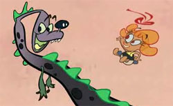 Comcast, the largest cable company in the US, has launched a new product called Triple Play, which combines phone, internet and cable services into a single package. Starting last week, new subscribers will also receive a free Nintendo DS gaming system, the dual screen gadget that released back in 2004. To promote this new offering, Comcast and their agency Goodby, Silverstein & Partners teamed up with John Kricfalusi, or John K as he’s known in the animation world. Kricfalusi is one of the founding fathers of Flash character animation, and is also the creative genius behind the Nickelodeon hit series The Ren and Stimpy Show. The result was a minute of Flash animation, featuring a 3-headed dinosaur puppet and some overly-enthusiastic kids.
WATCH THE COMCAST COMMERCIAL IN HI-RES (Quicktime – 18 mb)
OR LOWLY YOUTUBE QUALITY:
 John was kind enough to answer some questions about the project, and he brought along a few of the animators too, who you’ll meet near the end of the interview. This is the second CHF interview with Kricfalusi – the first took place back in April of this year, and covered his work on the very first online Flash animated series – The Goddamn George Liquor Program.AARON SIMPSON: How did Comcast get in touch with you?
JOHN KRICFALUSI: Kelsie Van Deman, an account exec at Goodby, Silverstein and Partners found me through MySpace. Ian Hart had written a commercial in the style of my LOG commercials for Ren and Stimpy. At first they wanted to shoot it live with puppets, but then the art director, Mike Coyne thought, “Hell, why don’t we find John and get him to animate it?”
The LOG commercial from The Ren and Stimpy Show
AARON: How did the idea for the spot emerge?
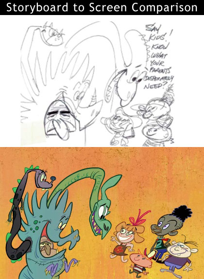
JOHN: It was their idea, but I flew up to meet with them in San Francisco and I sat down and drew the storyboard in front of them. Everyone pitched in with ideas and we basically sculpted it right there.They originally wanted a 45 second spot, but had written a long script. The script was originally 2 1/2 pages long, which I knew from experience would turn out to be 2 1/2 minutes. I took the storyboard and had Marc Deckter make an animatic, where I recorded me doing all the voices as a temp track.
Sure enough it was 2 1/2 minutes long.
The Goodby team had explicit orders from Comcast not to let the commercial be longer than 1:15, so we all worked together to cut it down. It was hard to do, because there was more funny stuff in it.
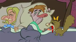 AARON: What was the goal of the commercial? Who is it targeting?
JOHN: That was the tricky part. They wanted it to pretend to be aimed at kids, but really be aimed at hip parents who would catch the satire in it.It was a delicate balance because Goodby wanted it to be edgy, but if it was too edgy, then kids might actually see it, get their parents mad and then have irate parents yelling at Comcast.
I decided to make it as candy-like and happy as possible visually, because it is a bit cynical if you just listen to the message.
AARON: Who did the character designs and backgrounds?
JOHN: I got Rex Hackelberg, the king of happy design, to create the characters and then I did most of the posing and layouts.
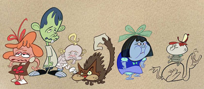
AARON: What type of direction did you give Rex as he set out to design the characters?
JOHN: I sent him my storyboard, and said draw funny kid characters and a bored middle aged man in a 3 headed dinosaur suit.
He sent me tons of doodles and made it very hard for me to choose. There were so many great ideas for the dinosaur suit that I mixed and matched the parts I liked most and probably ruined his style!
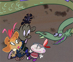 I didn’t have to “direct” him to do designs in his own style. My new working method is possible because of the internet. When you have an actual studio in a certain city, your talent pool is limited to who lives there and is available. I have to train a lot of artists to learn my style, system and methods. That costs a lot of money, takes time and it frustrates the artists who don’t get it. Their frustrations pass on by osmosis to the artists who do get it.
Now I can work with people whose styles already fit with mine or I can discover people on the blogs whose styles and skills I like. We get to try things that neither of us might have thought of on our own by mixing up our styles and techniques.
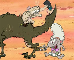 Brian Romero, on his own, inked up some Sody poses I did and sent them to me awhile ago. They were great! He kept all the organic sexy lines around her and didn’t lose the flair of the originals. Inking and cleaning up stylish animation drawings without blanding them out is a very rare skill. The whole animation studio system is geared to ruin individual flair and they actually train everyone to kill everything. I usually have to spend money untraining artists whose natural spirit the evil studios have destroyed.
Online I can find talented artists that have not been killed by the system. Or they find me!
The project goes a lot smoother and there is less direction for me and more fun for all.
AARON: Who painted the background designs?
Kali Fontecchio painted the most colorful background cards.

AARON: What type of art direction did you offer Kali before she started painting the BGs?
JOHN: I told her to read my blog posts on color and do exactly what they say to do, and don’t do what they say not to do. I like unusual colors that evoke mood or are just plain fun.
“Every brush stroke should be pretty”
“No primaries next to secondaries”
“No pink, purple and green”
“No pee and poo colors.”
AARON: The voice actors sound familiar. Who did you bring in to voice it?
JOHN: I hired 2 great voice talents: Gary Owens (Roger Ramjet, Space Ghost, Powdered Toast Man) and Eric Bauza (El Tigre, Ren & Stimpy, The Ripping Friends) to do very fun readings and that added a lot.
My whole goal was to create a light happy jovial feel.
 AARON: How long did it take to produce?
JOHN: A month. That’s about 10 times faster than any commercials I have ever done for TV.
I have a new streamlined system that saves a lot of time and overhead and I get to work with top people only.
AARON: What was the most difficult aspect of the spot?
JOHN: Cutting out some funny side gags and bits to make it fit into the time. That’s always difficult!
AARON: What’s up with that unusual aspect ratio?
JOHN: I’m not sure. That’s the format Comcast wanted. Kelsie suggested we put curtains on either side and just put the cartoon in the middle, but I thought, “what the heck, let’s see if we can just do it wide.” It’s a bit awkward, but I like to try new things.
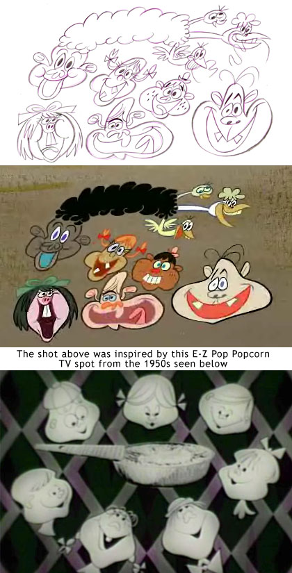
AARON: Did you draw inspiration from any classic cartoons for this piece?
JOHN: I know you set that up. Of course, all the Hubley commercial posts are the inspiration, as they were for LOG.
It doesn’t look exactly like those great commercials and if we tried to just imitate it accurately of course we’d fail.
The style of all my cartoons is the sum total of what the individual artists and talents bring to it.
That’s why I encourage everyone to take advantage of the fact that I don’t have a preset notion of what every detail should be. Break out of the studio chains and make something up!
AARON: How does this effort compare to your recent Raketu project?
JOHN: It’s definitely different. The Comcast commercial doesn’t use my existing characters and it’s not a personality driven cartoon. It’s meant to sell Comcast’s wares and be really fun visually.
The idea behind Raketu was to give the impression that different people in a family have individual uses for each of it’s features. Comcast is aiming at the parents, but pretending not to…
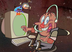 Also we smoothed out some bugs in the production system this time and we were able to make a more elaborate spot in less time.
I have to point out, it sure looks this TV network studio system is doomed. They can’t keep up with all the natural changes technology and the internet is allowing us to take advantage of.
The blog community of artists is the greatest thing yet. All of a sudden there are thousands of cartoonists who – despite whatever minor differences we may have, they are nothing compared to the shared experiences we have in being creatively stifled by the studios.
I’m hoping that this new world will bring actual animation back to our shores and with that, creative growth and fun for the artists and the audience.
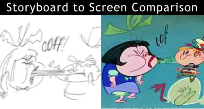
AARON: Which artists animated the spot?
JOHN: Eric Pringle and Kristen McCormick were my 2 main Flash animators, but I managed to get Will Finn to animate an old fashioned drawn scene and that was great to work with him.
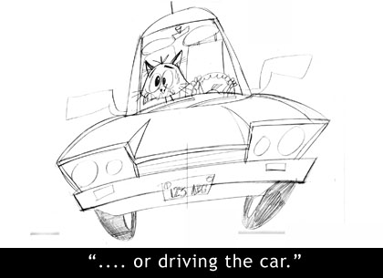
And now a few questions for Eric and Kristen, two animators who also work on Cartoon Network’s Fosters Home For Imaginary Friends.
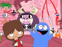 AARON: Eric, You’ve animated a great deal of John K’s Flash work – dating back to the Spümcø days.
ERIC PRINGLE: I animate way differently now. When I first started at Spümcø I didn’t know how to animate at all. Also, the way we set up our files has evolved tremendously. We weren’t hip to comps (nested timelines) and everything was animated on the mainstage. We still used instances but it was really archaic the way we were doing it back when. It’s funny how we clung to our methods claiming them as “Flash secrets.” Looking back on those files I’m really embarrassed. Now that I am slightly more confident in my animation, I know how to set eases on my tweens and I don’t feel compelled to antic-overshoot-settle all the time. I still seek advice from John, Craig Kellman, and Matt Danner because I still have a lot to learn and need some slapping around every once and a while.
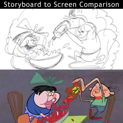
AARON: Does this type of animation differ from a TV series?
ERIC: Totally. On the TV series that I’ve worked on, everything is stock digital puppets with a few special poses here and there. On the Comcast commercial nothing is stock – John drew layouts for everything. I enjoy working with layouts a lot more, the poses tend to be stronger and more organic. Working with stock it’s always a matter of trying to Frankenstein a pose together, like getting the correct hand from the library to fit the pose, “eh, it’s the wrong angle, hopefully no one will notice.” However, for me, working with layouts makes the turnaround time much longer; maybe I’m just not accustomed to that kind of process anymore. From my experiences working with both layout and stock pipelines in Flash, working with stock is the best way of going about making a TV series. Layouts require too much clean up and rigging that would most likely bottleneck somewhere in the production. Though the quality is better with layouts, it is just not economical for the demands of the studios with tight budgets and tighter schedules, especially when competing with overseas shops. But for a short, like the Comcast commercial, it’s totally the way to go. What was the question again?
KRISTEN MCCORMICK: I agree! Working for John K is different that any work I have ever done. Each project he does requires a different approach. He won’t let you use any formulas you’re used to. He hates formulas! I often start on a John K animation project animating a certain way, the way I am used to. It usually ends up being completely the wrong way, and by the end am doing something totally different, something that I would never have thought of. I always learn a lot.
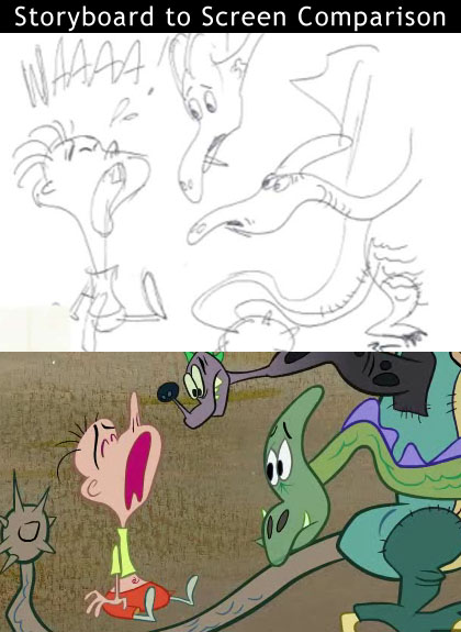
AARON: This spot appears to be an homage to Bob Clampett’s Beany and Cecil cartoons. Did you use any reference/inspiration for timing and movement for your animation?
ERIC: I’ve actually never watched Bob Clampett’s Beany and Cecil before but I did notice the resemblance when I started on the project. For some of the scenes of the commercial, John told me I should reference some of Clampett’s Looney Tunes for the timing. Along with referencing Looney Tunes, I’m always referencing Foster’s, since I look at it everyday. Some of the animators on the crew have some really interesting techniques that can be really helpful.
KRISTEN: I started working on this Comcast project a little late, so I was inspired by the awesome animation that had been already done by Pringle. But I had been thinking about the recent posting John had done on the Hubley salt commercial such beautiful animation. And such great use of timing. John wanted me to look back at the animation Copernicus had done on the Tenacious D video. They did some amazing work that is very humbling and inspiring to study.
AARON: What type of direction did John give you before you animated?
ERIC: John’s main goal was to make this commercial not look ‘Flashy’ but still be smooth. He didn’t want too many overshoots, even timed tweens, or over distorted drawings using the transform tool. Most of the revisions he gave me were to substitute overshoots with slow ins to eliminate the jerky animation we often see in Flash cartoons. He also acted out all the shots for me, the most memorable was him rubbing the mouse on his head to demonstrate what shaving a dog should look like.
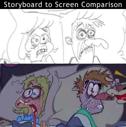
KRISTEN: He tries to be very thorough in his direction, acting it out, making timing notes or quick sketches for where the actions should happen. After taking the first pass on the animation I get a lot more direction. Their are usually several retake sessions on any given shot, especially early on I have to unlearn the typical way I do things.
AARON: The aspect ratio is so wide and atypical. Did that present any challenges?
ERIC: It sure did. John drew everything in standard def (16:9 ratio), and I had animated most of the shots in standard. We didn’t find out what the ratio was until halfway through the production. John improvised and added drawings to most the shots to fill the space and also broke one of the shots up into an assortment of vignettes that covered the wide ratio. He described this shot as one of those dumb things Disney used to do. It wasn’t too hard, for me anyway, to make the switch from standard to extra wide. I think it all worked out.
KRISTEN: My part of the project didn’t really get affected too much by that. After I was done animating, some of the drawings got modified. Also editing and other really cool things were done to make better use of the unique shape of the screen.
AARON: Compared to your Spümcø work, do you animate any differently now or use any new tricks?
ERIC: Everyday I’m learning some kind of new shortcut that makes lives easier. On the Comcast commercial I used some shape tween methods we use on Foster’s. After setting the shape tween, I keyframe it out and use the layer frame distributor plug-in and then export the FLA (Flash file) to an Illustrator file and apply the art brushes and import that stuff back into flash. I did that with the dinosaur’s neck and the dog’s nose animation. Also I used the tween2keys plug-in to eliminate some of the tweeny animation in some of the shots, but that’s not really a trick. For the vibrating fx on the burst and weird shapes I just made some shape tweens and then clicked the smooth tool a few times to slightly distort the shapes on each frame. Other than that stuff, I didn’t do anything other than slide John’s drawings into each other and hope for something nice.
AARON: Thanks everyone. For more on the Comcast spot, head over to John K’s blog and check out his posts.
PRODUCTION CREDITS
Character Design
Rex Hackelberg
Animation
Eric Pringle
Kristen McCormick
Leo Riley
Greg Franklin
Will Finn
Inks
Brian Romero
Corbett Vanoni
Background Designs
Kali Fontecchio
Voices
Gary Owens
Eric Bauza
Deneo Harris
Kelsie Van Deman
Amy Maloof
Production Coordinator
Marc Deckter
Production Assistant
Joe Henderson





July 16th, 2007 at 7:26 pm
Good article, CHF! I hope to see more of John K. and his team’s work on the mainstream.
July 16th, 2007 at 8:07 pm
awesome! and interesting! what’s next???? i hope they keep rolling out more john k projects, i really can’t wait for his next short(or feature).
p.s. will finn is mentioned in the article but not included in the production credits at the end
July 16th, 2007 at 8:57 pm
right on, looks like fun!
good article Aaron.
July 16th, 2007 at 9:00 pm
Awesome interview! Where can I go to watch the commercial? The link that says watch the commercial brings me to signing up for their services.. I just want to watch the animation.
July 16th, 2007 at 9:01 pm
Hey Aaron, the commercial isn’t on the page you linked to. Try this instead.
http://www.comcast.com/nintendo/
July 16th, 2007 at 9:21 pm
Thanks for notes on Will and that Nintendo link. Typing a little too fast over here. Always in need of another set of eyes. Really appreciate it….
July 17th, 2007 at 12:56 am
Nice interview dude!!
July 17th, 2007 at 2:43 am
Question for you web historians: Is this the first Flash animated internet spot in wide screen CinemaScope?
John did a great job playing with our peripheral vision, filling the screen with art on all corners of the screen. Kimball did this in TOOT WHISTLE PLUNK AND BOOM — really using the width for dramatic (or comedic) effect.
A beautiful spot.
July 17th, 2007 at 5:03 pm
ANSWER TO JERRY BECK: No sir. There have been literally hundreds if not thousands of internet flash shorts produced in widescreen,scope,etc…. geezum… i can only imagine the collective orgasm when john actually produces an actual *show* again.
July 17th, 2007 at 11:01 pm
wow, I didin’t like that animation at all. There was way too much visual garbage on the screen. My eyes were totally racing around the screen to attempt to catch everything. I found myself looking at elements that weren’t crucial or even necessary to the cartoon. Just diverted my attention from the main action or purpose of each scene.
Yick, it was like the cartoon was spinning in a blender at high speed: frentic and nausiating.
July 17th, 2007 at 11:16 pm
i agree with ryan. you know what makes it nauseating? no sound. if john had bothered to use sound effects to emphasize the action, our eyes would’ve been drawn to the right place. instead, the animation just floats in a vacuum. also, i thought john never repeats expressions? i saw the same static expressions on those characters throughout. after all the ‘i am so great’ lectures, i expected more.
July 18th, 2007 at 12:32 am
I agree that the expressions and mouth positions were pretty bad. For example, when the baby is crying and then starts to talk, the voice is unintelligible, so you look at the mouth to help you decipher what is being said, but the mouth positions are so exaggerated and extreme, that they are of no use. I still don’t know what the baby said. Something about ‘grandma’ that’s all I got out of it.
I think John’s thinks he’s pushing the envelope by breaking all kinds of rules. In reality he’s gone so far out there, that there’s nobody out there with him.
July 18th, 2007 at 2:18 am
Let’s see you do a better one in a month.
July 18th, 2007 at 3:00 am
“Yick, it was like the cartoon was spinning in a blender at high speed: frentic and nauseating.”
Anyone who’s viewed your reel knows that you can’t understand animation that isn’t completely stiff and robotic.
July 18th, 2007 at 7:33 am
No, Ryan is right… it really is bad animation.
John is knowledgeable about animation, but it has never translated into his work. He always comes up with an excuse as to why his animation is intentionally crappy or handicapped by the powers that be. I guess it is easier for him to just be hyper-critical of other people.
July 18th, 2007 at 5:40 pm
“I think John’s thinks he’s pushing the envelope by breaking all kinds of rules. In reality he’s gone so far out there, that there’s nobody out there with him.”
Pretty funny that there’s an incredible number of people that would disagree with that. Then again, it’s pretty easy to disagree with some worthless, subjective, opinion hastily coughed up without a good reason and just looking to be critical on someone you apparently just don’t like to begin with. The mark of the true hypocrite.
“No, Ryan is right… it really is bad animation.”
Yeah. I suppose that’s why it ends up looking about 10 times more fluid than nearly all flash animation using a lot of tricks that apparently even some of the “best” flash animators dosn’t even have use for, apparently. Considering that Flash isn’t even John’s preferred medium, I think that says a hell of a lot. More than your post did, anyway.
“John is knowledgeable about animation, but it has never translated into his work.”
Whoops. I guess that’s why he was able to get Rough Draft Korea to have much better quality than their work on poor cash-in’s for 80′s Video games.
I guess if you want to just pretend like that never happened and make yourself believe that you have some kind of a point, you can. Although you don’t really look very smart for it.
“He always comes up with an excuse as to why his animation is intentionally crappy or handicapped by the powers that be.”
Nope, sorry. Don’t think he’s ever offered an excuse of that, more than he’s been just as critical of his own work on commentary. Again, thanks for making up a point that dosn’t exist in order to hide the fact that you’re ignoring a better one. You’re so intelligent.
So, what’s your excuse for the assumption based on ignorance that you don’t know?
“I guess it is easier for him to just be hyper-critical of other people.”
Or for you to be even more critical of someone with a hell of a lot more experience in the field then you’ll ever have, from the sound of it.
I hate people who have their own ignorant biased, hatred, and form some kind of negative opinion out of that rather than knowledge of any kind.
THose kinds of people are failures. People that fail to make a point, or to prove that they know what they are talking about.
You know, versus someone who is able to back up their opinion with experience and knowledge of the field. Kinda like John K has.
Funny thing, that.
July 18th, 2007 at 7:13 pm
in response to karma….
i disagree with ‘anonymous’ AND i disagree with you…… this comcast thing didn’t really break any rules that hadn’t already been broken by far more prolific flash animators. sure john and ashkar came up with some cool stuff with flash 2 back in the day, but it appears that john’s advancements with flash work stopped there while many others blew right on by. so there really wasn’t any envelope pushing here, both in content or execution. but because it’s john, everyone claims that it’s waaay innovative.
that being the case, the drawings look awesome and john & co. can draw circles around 99% of cartoonists. but you know, it’s what you do with those drawings that counts, and if your going to write an instructional blog in lieu of actually animating, and if you’re going to publicly tear down other working animators to satisfy your own ego, then you know….when you DO actually produce something, it better be worth all the hype.
Will
July 18th, 2007 at 9:53 pm
“the drawings look awesome and john & co. can draw circles around 99% of cartoonists. “
Agreed. The man is still a fearsome talent and he gets good work out of his crew, given the time constraints.
“but you know, it’s what you do with those drawings that counts, and if your going to write an instructional blog in lieu of actually animating, and if you’re going to publicly tear down other working animators to satisfy your own ego, then you know….when you DO actually produce something, it better be worth all the hype.
Agree with this , too. It’s not like this thing is the worst or the best animated web ad ever done … it’s “ok” , just average. If it didn’t have JOHN K’s name attached to it I doubt we’d even be discussing it .
This and the Raketu spots are sort of blah , animation-wise . Nice designs , yes , but the animation is mostly limited and bland. Someone else needs to go back and read Preston Blair again, too.
(could I do better with a one month animation schedule start-to-finish ? No. But some of the other “modern day cartoonists” that John constantly slams on his blog have tight deadlines which effect the quality of their work too. What’s weird is to read the sycophants on his blog rave about how this Comcast thing and the Raketu pieces are so great and groundbreaking , but they just aren’t… C’mon people , get a clue. )
July 20th, 2007 at 1:01 pm
Why would anyone animate this kinda stuff in flash? It’s lot’s of work and the result doesn’t look alive but more like just a few pictures. Why wouldn’t you just use the flv playback component if you are not putting any interactivity in there?
July 20th, 2007 at 3:52 pm
That video on the Comcast website is actually streamed as an FLV – it’s just a really good render, so it looks like a vector version.
August 7th, 2012 at 5:37 pm
[...] K Interviewed About Comcast AdJohn K Interviewed About Comcast Ad July 17, 2007 by screw on headColdHardFlash has an in-depth interview with John Kricfalusi about his work on a new Comcast commercial. Also interviewed are animators Eric Pringle and Kristen [...]